Saunter
A mobile-first travel planning tool. Your personal trip assistant.
Spend less time planning and more time traveling.
Travelers spent $1.1 trillion on domestic and international travel in 2019 alone (S. Lock, Oct 5, 2020). When it comes to planning, booking, and participating in vacations most travelers are inclined to manage the entire travel journey using technology. Unfortunately, travelers are faced with a fragmented experience across several different tools -- none of which fully serve their travel needs. Travelers find trip planning tedious and the process of organizing itineraries stressful and time consuming. Travelers should be able to plan, coordinate, and manage trips with less effort. Having a more streamlined tool would allow travelers to worry less and enjoy their trips more.
Timeline
2.5 months
UX challenge
Make the process of planning a trip and managing an itinerary quick and collaborative.
Assumptions
Travel planning is too time consuming
Users would like an easier way to discover and save new places
Users want to use fewer tools
Budgeting is important for planning trips
Traveling in groups is difficult to coordinate
Organizing shared travel recommendations is not simple
Key learnings
Travelers want help with planning so it doesn’t feel so overwhelming
Collaboration is key and currently no tools exist for both planning and itinerary management
Travelers are eager to use technology to assist them with planning
The solution
A mobile platform that allows travelers to explore, share, plan, and manage trips in a single touchpoint for a more streamlined and collaborative experience.
Project goals

Reduce the amount of time research and planning takes
Less time planning means more time spent enjoying the trip.

Reduce the number of touch points needed
Streamlining touch points can reduce booking errors and users being overwhelmed when planning.

Increase collaboration
By centralizing trip details and reservations to better manage shared plans, traveling in groups can be less stressful.

Reduce schedule conflicts
Provide shared itineraries and personalized planning reminders that are timely.
My approach
Brainstorming
To ideate about my concept I spoke with friends, family, and colleagues then I gathered thoughts on sticky notes. I thought about issues I have and ideated about my areas of interest. I decided to look at issues in the travel sphere because travel is one of my greatest passions. I did light sketching, wrote out ideas and subsequently started research.
Research
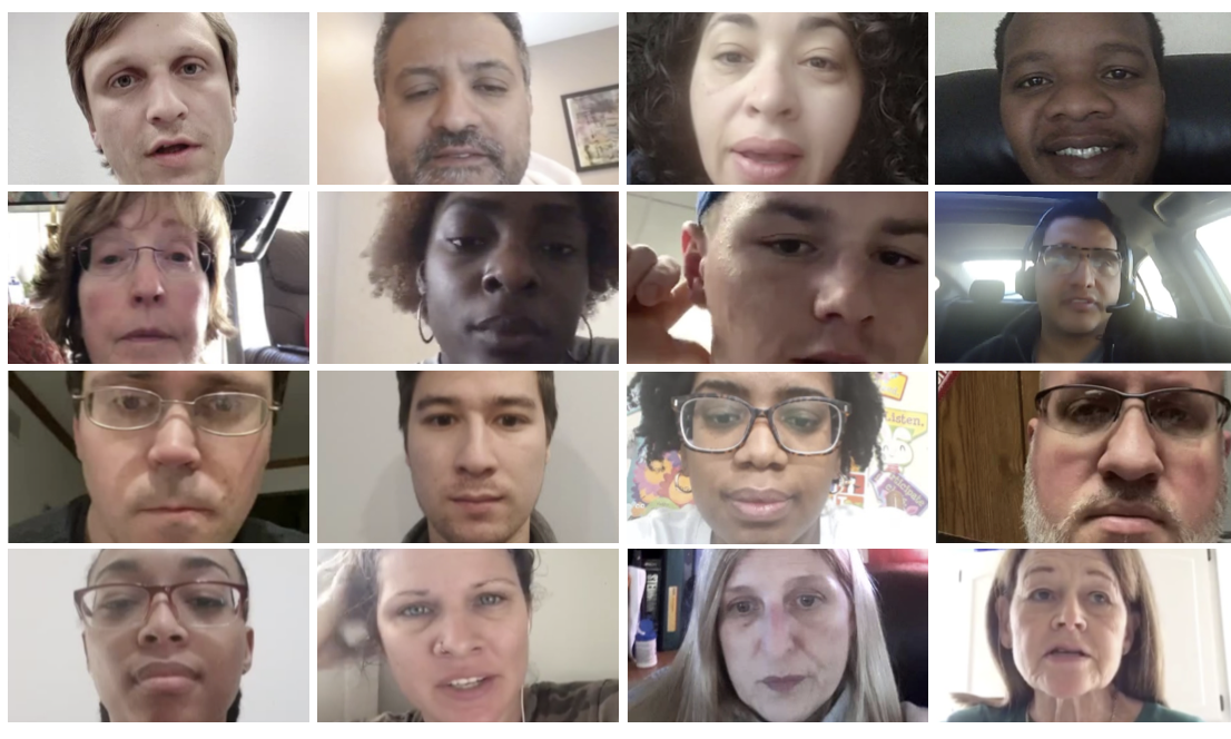
I started with desktop research followed by a competitive analysis where I examined 9 companies to understand the current landscape. I did market research to gain a better understanding of the industry and issues that travelers face as well as market trends. I conducted user research by constructing a user survey to gather user insights and understand user pain points.
Concept development
I explored ideas for a travel budgeting tool but found through user research that budgeting wasn’t as big of a need as collaborative itineraries and planning assistants are. I did a feature prioritization mapping exercise where I completed 2 iterations of user flows. Both iterations underwent usability testing to see users reactions to features in the concept.
Research summary
20
User survey results recorded
2
Rounds of concept testing with 10 participants
9
Competitors analyzed
1
Round of RITE testing with 5 participants

User survey
Key insights:
Travelers want to create organized travel itineraries but planning takes too much time. Travelers don’t know how to fit everything in their schedule without overbooking or not having downtime to rest.
Travelers try to organize their travel plans using technology but too many tools exist with different functions. They can’t keep plans organized and easily accessible so they often miss out on things they want to do on their trips.
Travelers want to share the work of planning and managing itineraries with their travel partners but no good tools for collaborative itineraries exist. Getting everyone on the same page when traveling in a group is difficult. Scheduling errors are likely to occur and are hard to spot and remedy.
Why I chose this method:
I needed to conduct user research remotely and turn around an analysis quickly. I wanted to ask many in-depth questions in a short amount of time and with this method I was able to reach a greater number of users in a shorter amount of time compared to other methods, such as user interviews. I originally had wanted to conduct a diary study but with the tight timeline and the inability for most to travel, a user survey seemed more appropriate.
I probed to find out users biggest pain points as well as experiences that inspire. I collected 20 responses from which I took the data to complete an affinity mapping exercise. I then took the groupings of info and formulated research insights.
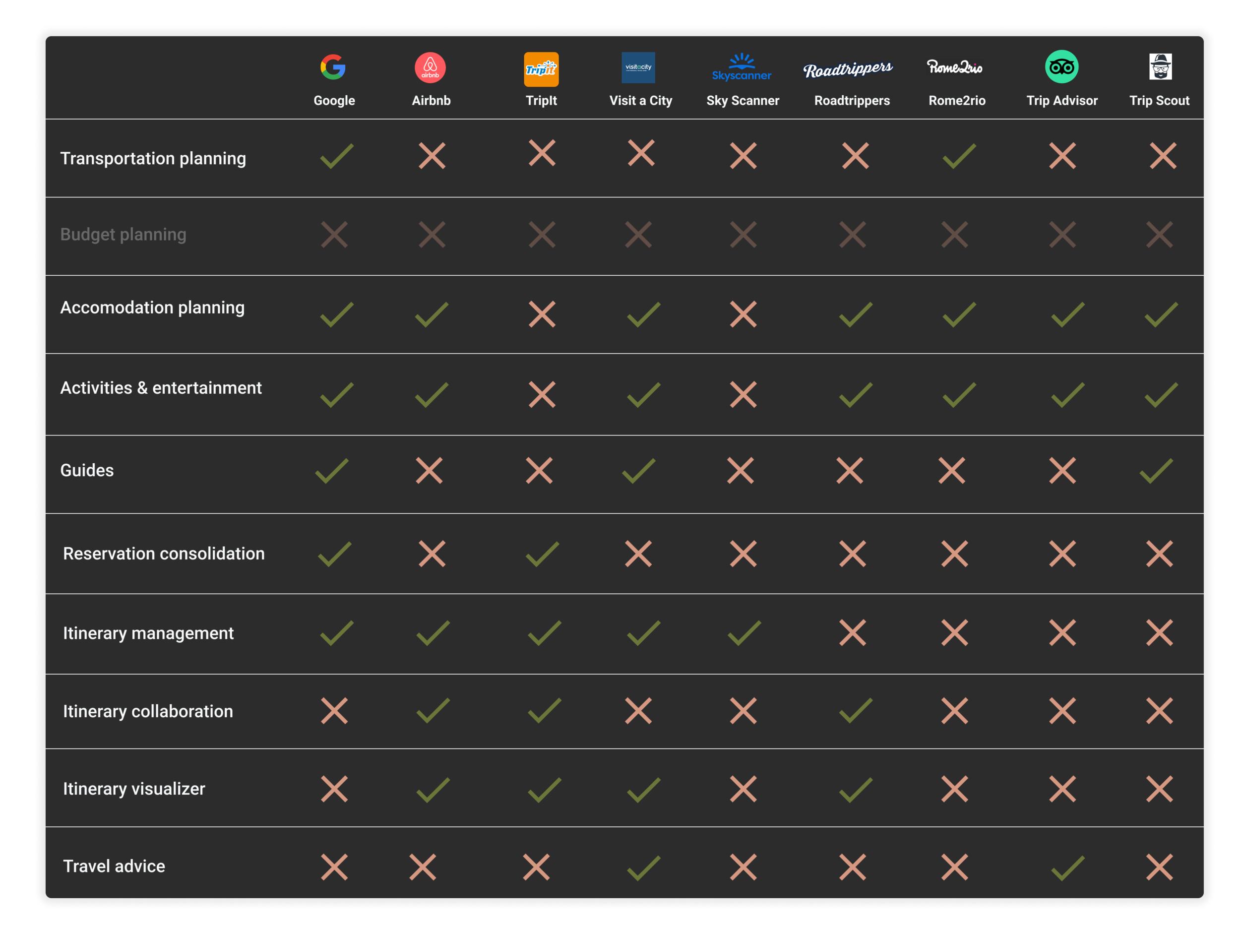
Competitive analysis
Findings:
No single tool takes care of a traveler’s needs across the journey in one application
The tools that exist are limited to resources from within their own system
They don’t connect or sync with other applications
Users need to manually coordinate data from each application they use across the journey
In research I found the budgeting is not that important for travelers
Why I chose this method:
I wanted to understand the current landscape and tools that exist. I needed to evaluate what features are the most valuable and what opportunities still exist.
Who is the user?
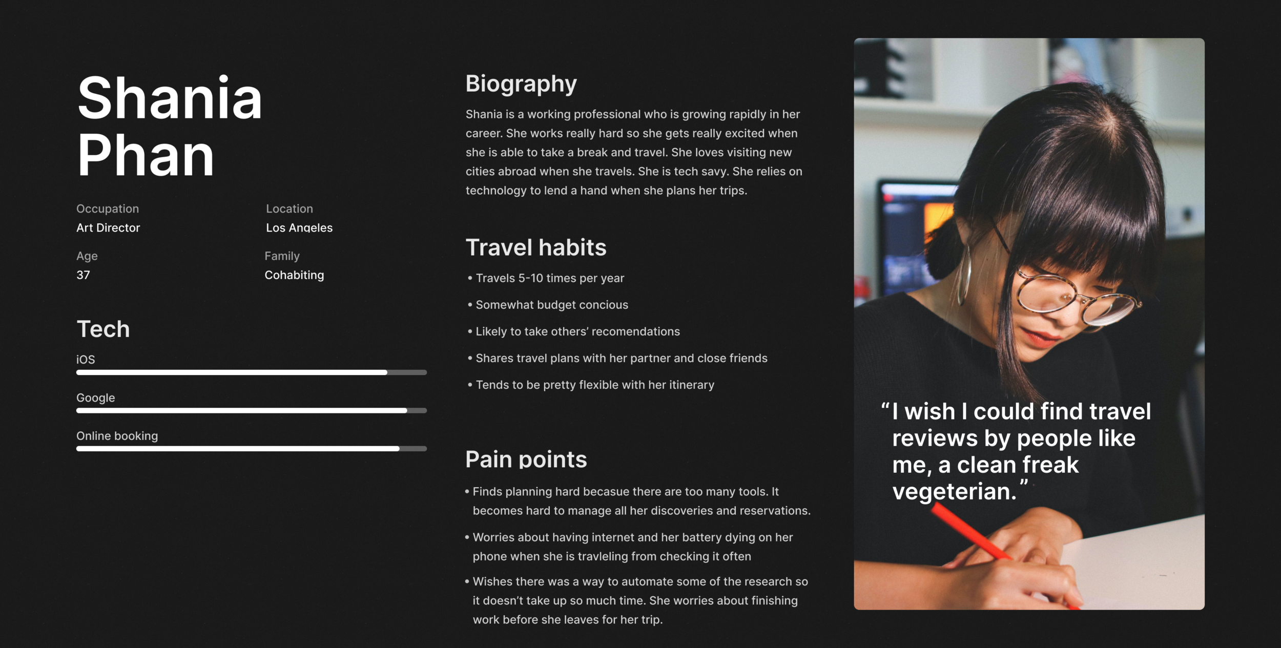
Meet Shania
A creative professional who loves travel but doesn’t have time to plan.
Why I chose this method:
It is important to keep the user in mind when designing. Having the persona which was created from research findings, helps to keep the target user at the forefront. After gathering user research data I was able to construct this persona which shows the target user for this concept.
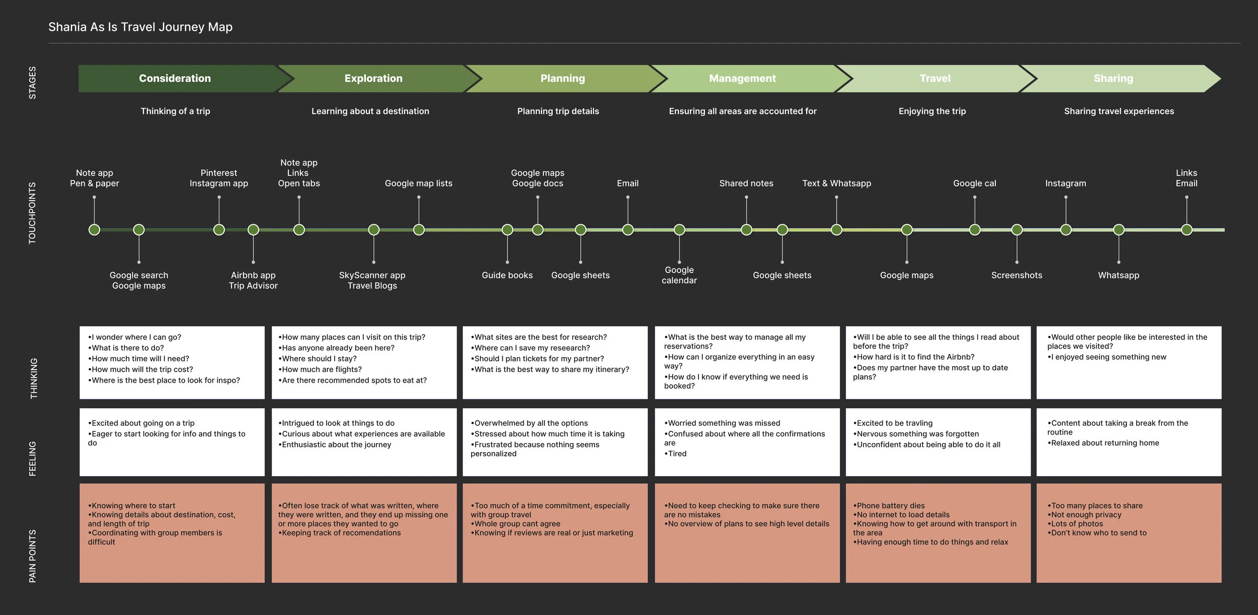
The As-is journey
Concept development
Concept Evolution:
I explored ideas for a travel budgeting tool but found through user research that budgeting wasn’t as big of a need as collaborative itineraries and planning assistants.
I completed a feature prioritization mapping exercise to prioritize which features to build out first
I did 2 iterations of user flows which both went through RITE testing to see users’ reactions to features in the concept.
Usability testing
Why I chose this method:
I wanted to get the concept in front of users to ensure information was presented clearly, and that users found value in the features being developed. After testing I needed to shift my concept a bit to focus on collaboration and saving time.
Findings:
Budgeting wasn’t as big of a need as collaborative itineraries and planning assistants.
Visual design
What design directions were explored?
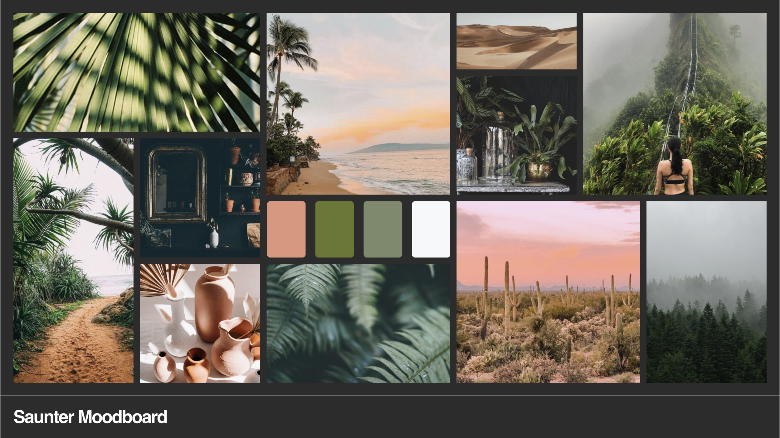
To develop a strategic style for the UI I did a mood board to determine the desired look and feel. I did a round of RITE testing to gauge users reactions to the visual design and made updates based on those findings. I tested the prototype with visual design applied with 5 participants. Additionally, I showed an A/B test of the landing screens to determine the more innovative approach to visual design for the concept.
Development
The final deliverable is a high-fidelity prototype. I have explored the real cost of working with developers to implement my designs and make the concept real. For the current implementation the concept will live on as a prototype.
Outcomes
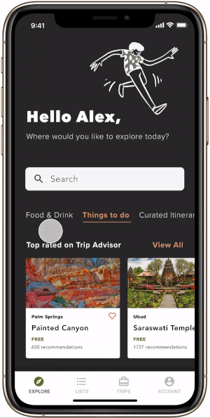
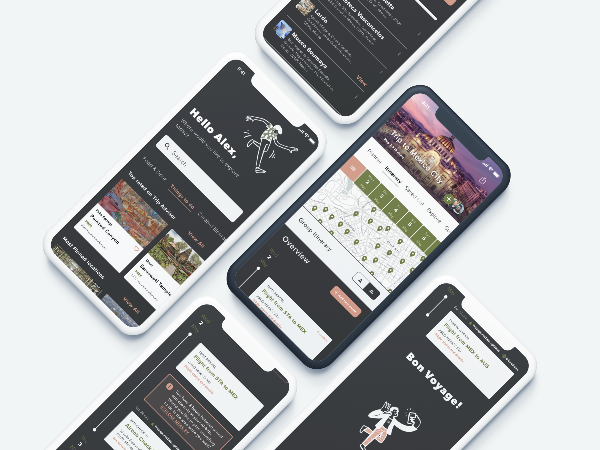
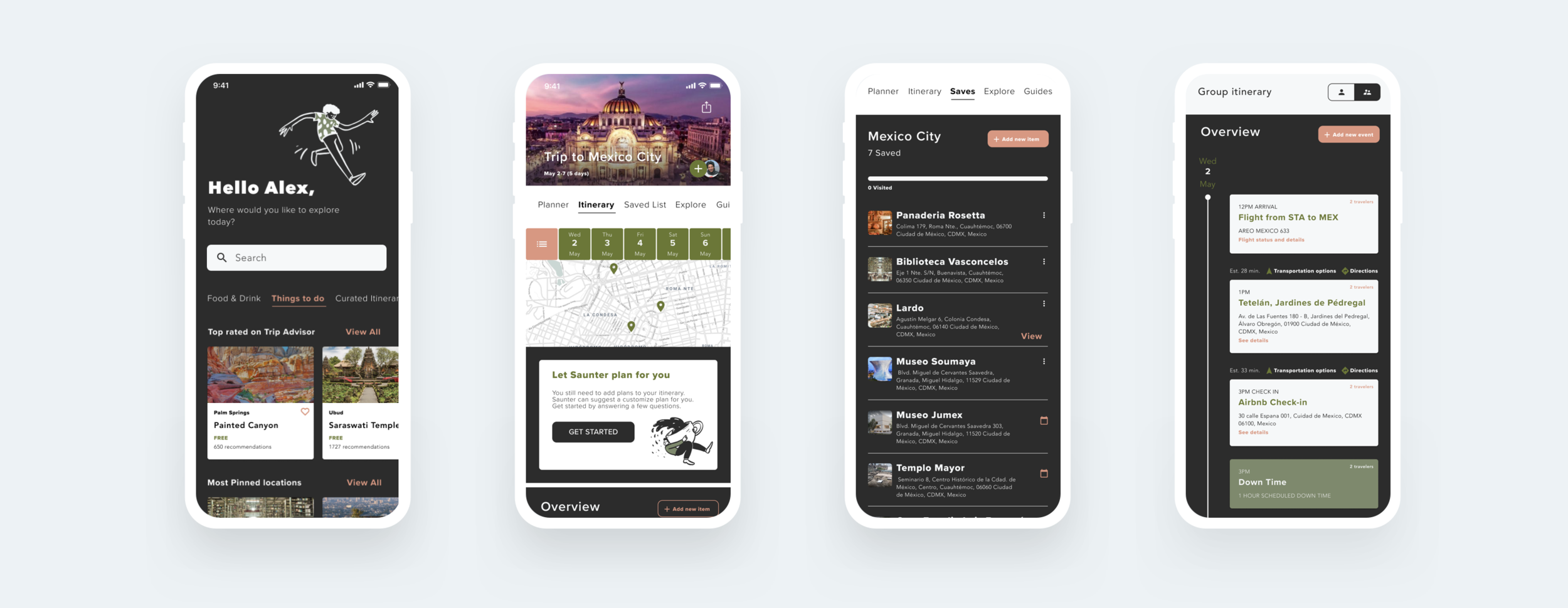
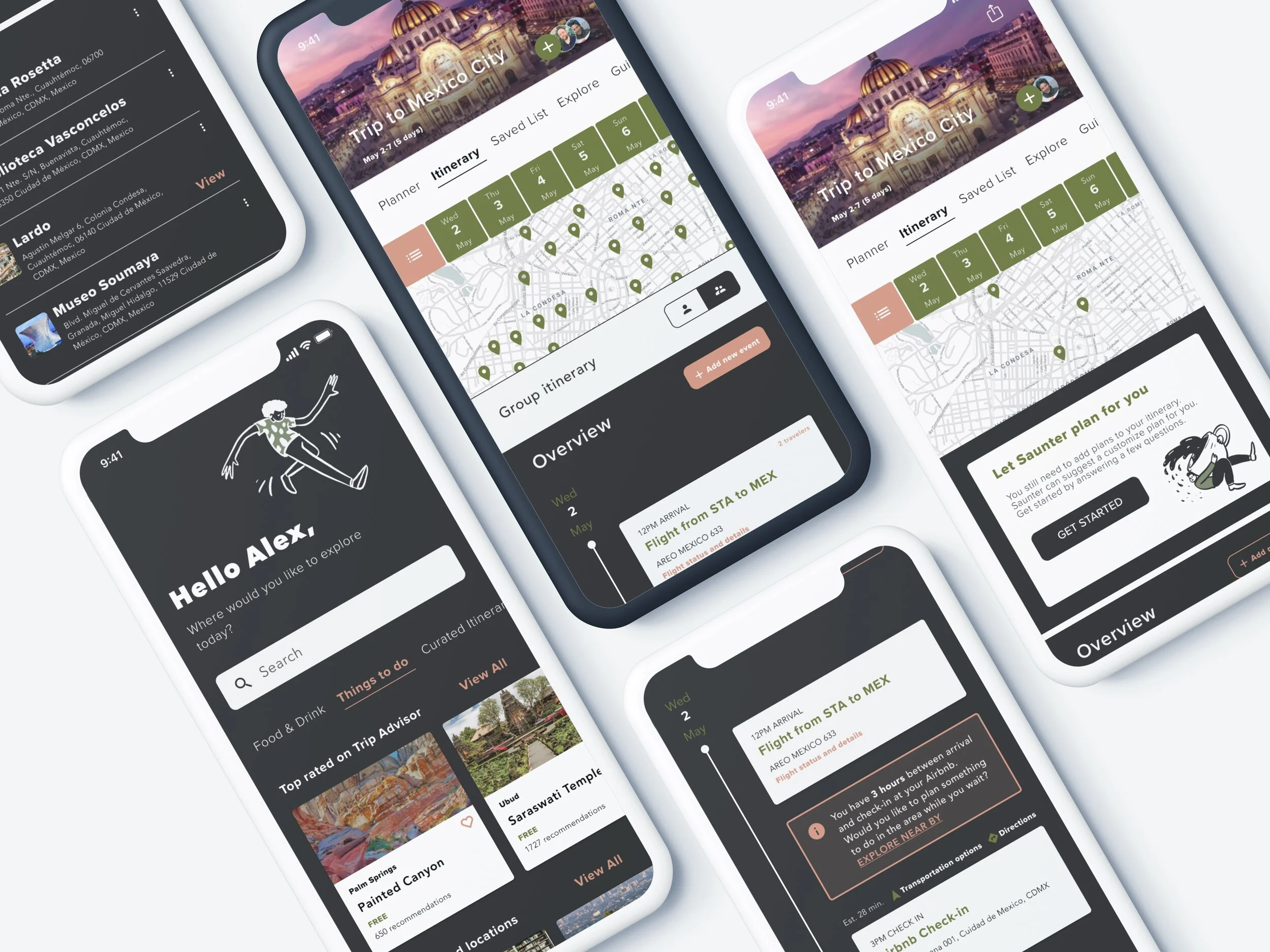
Explore
Key features:
Curated categories based on travel recommendations
Robust search that lets travelers find more tailored discoveries
Save discoveries to shared lists for planning later
Peer reviews from the travel community so travelers can trust recommendations
Pricing is shown for budget-conscious travelers
What I heard in testing:
Users want to discover, save recommendations, and create plans in the same place
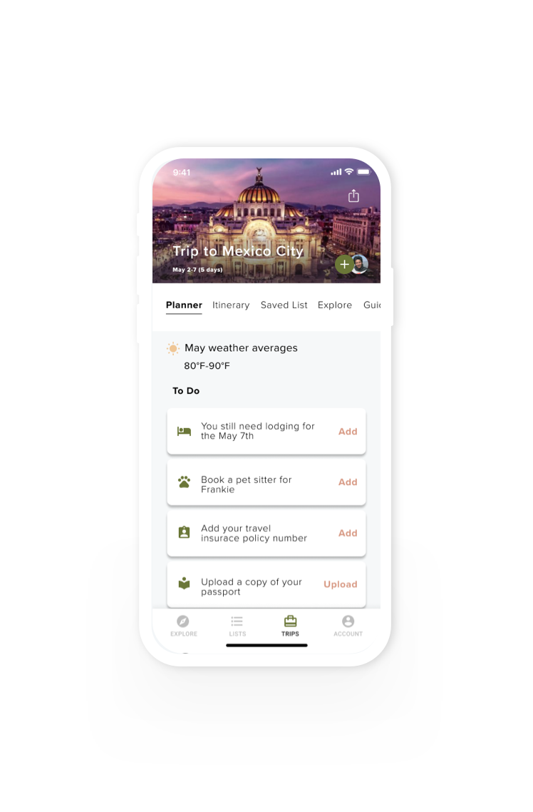
Planner to-do list
Key features:
Custom planning reminders to ensure all trip prep is complete before take-off
See weather averages at the trip destination to make sure the right gear is packed
Booking reminders to make sure all necessities (such as lodging) are accounted for
Reminders to upload important travel documents so travelers aren’t caught unprepared
What I heard in testing:
Users want to have helpful reminders when planning so they don’t forget crucial details
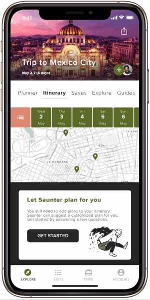
Custom itinerary curated by Saunter
Key features:
Saunter asks users tailored questions to create a curated itinerary based on each traveler’s specific likes and needs
No research is required
What I heard in testing:
Users love the idea of not having to spend hours sifting through travel plans. They prefer an assistant to lend a hand
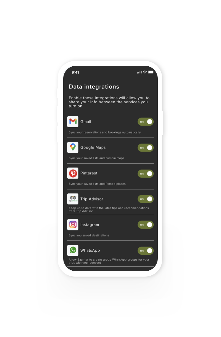
Data integrations
Key features:
Data from key apps and other travel sites is pulled in for centralized exploration and planning
Sync data to keep plans updated across tools
What I heard in testing:
Users are more likely to use tools that talk to each other because they don’t want to manually update all tools
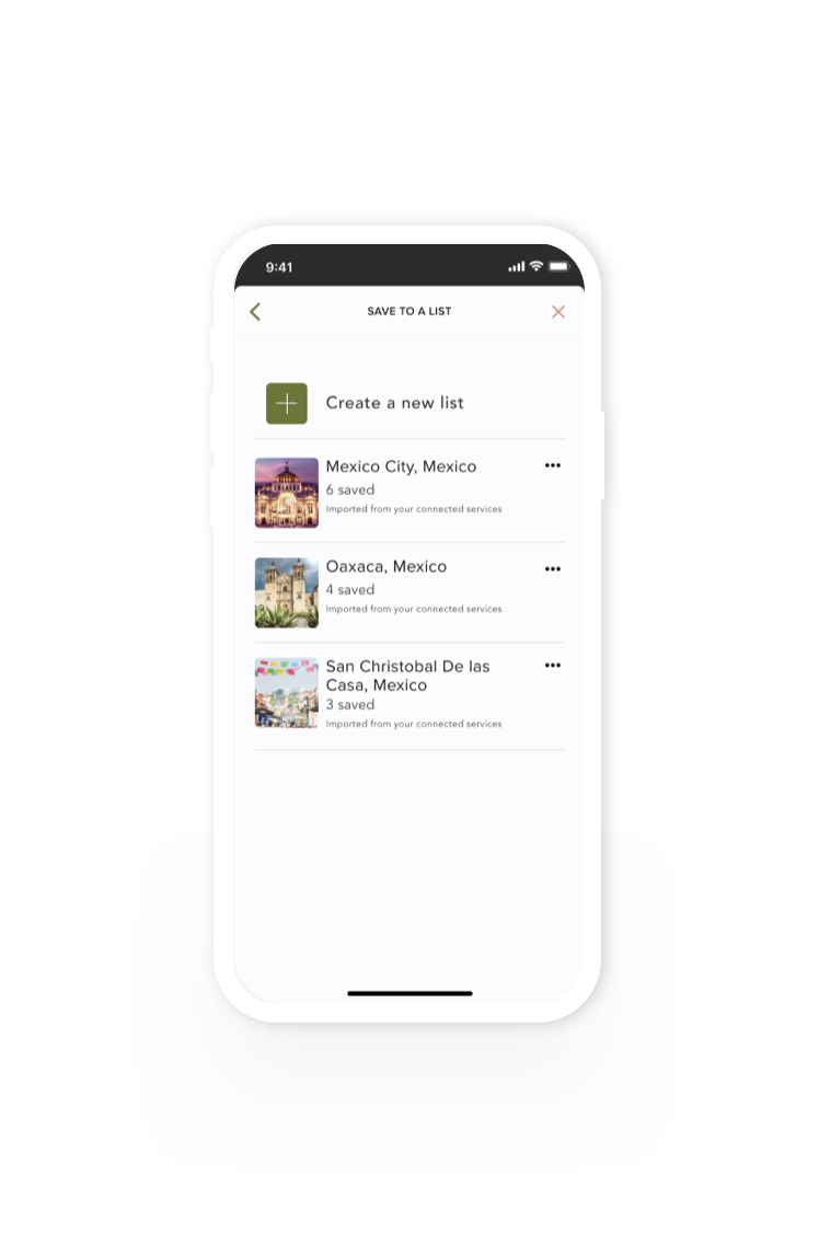
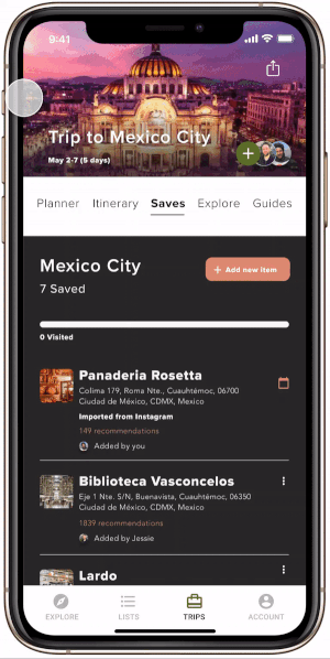
Imported saved lists
Key features:
Likes and saves from other tools are imported to create saved lists
Travelers can continue adding to saved lists or start new lists
What I heard in testing:
Users like the idea of travel lists being imported from their other accounts because it gives them a head start with planning which saves them time
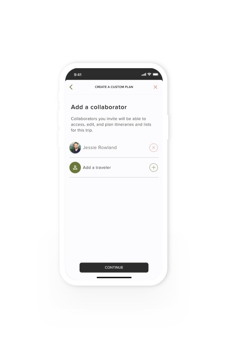
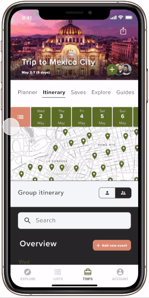
Add collaborators
Key features:
Travelers can add collaborators who can edit and co-create, saving time and reducing errors
What I heard in testing:
Users value having two sets of eyes on plans to avoid booking conflicts and save time
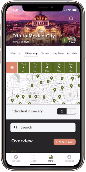
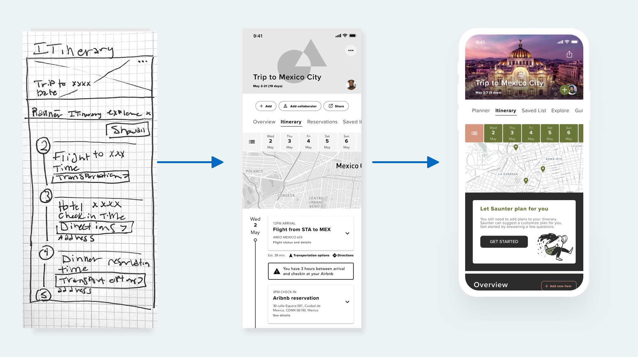
Shared itineraries
Key features:
Individual and group itinerary view
Full itinerary view or specific days for scoping out the details
Highly tailored directions and estimated transit times between each destination
Scheduled downtime
Schedule conflicts visualized
Add and manage collaborators
What I heard in testing:
Users love being able to view multiple itineraries in one place and share trip details
Shared lists
Key features:
Saved lists are updated from integrated tools
Collaborators can add or edit
What I heard in testing:
Users value having one source of truth for recommendations and places of interest which can be easily shared
Schedule conflicts
Key features:
Schedule conflicts can be easily caught and changed by proposing alternate plans
Collaborators can vote to determine which plans to adopt on the shared itinerary
What I heard in testing:
Users want to reconcile conflicts easily. Having options to resolve conflicts is key so all travelers are on the same page
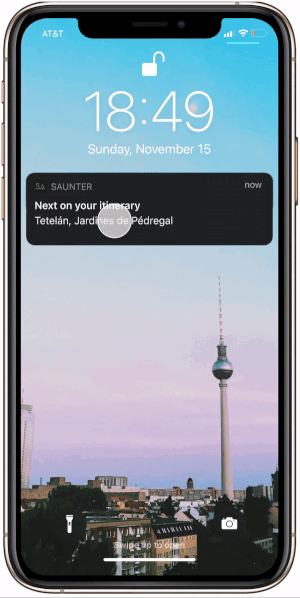
Push notifications
Key features:
Push notifications show what’s next on the list so users don’t have to keep the app open
What I heard in testing:
Users like notifications because it will save them time and keep their battery from draining
Wrapping up
Final thoughts and next steps
Next steps:
Reevaluate IA with a card sorting activity
Consider Apple Watch integration
Establish guidebook integration
Challenges:
Figuring out what features are the most impactful and best solve users pain points while traveling.
Asking the right questions when creating custom itineraries for people.
Making sure travelers get a trip that is specific enough for their likes or needs.
Addressing travel needs during a global pandemic where travel was out of reach for the vast majority of people.
Reflection:
It is key to revisit insights often to make sure the right problems are being solved.
It isn’t wise to take 1 person’s opinion as imperative during user testing. If it keeps coming up it could be a pattern but don’t be quick to jump on every suggestion.
I would have spent more time rendering out different views for the main feature of the app - the itinerary screen.
It looks slick, I want to use this app!
-Testing participant
Credits
Meghan Lazier
Thesis Professor